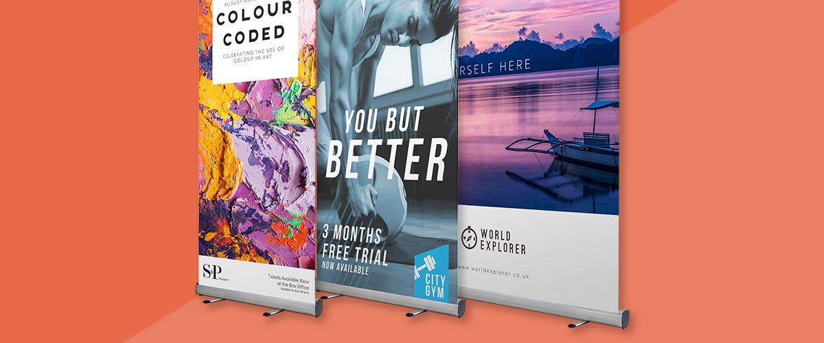
When you are designing a roller banner or a PVC banner and you don’t have much space for artistic input, it can be tempting to go overboard on the fonts to make up for it. However, it is important to consider that, in general, font design should be simple and striking rather than highly creative and complicated. Designers stick to a few effective font types for good reason. While there are many different artistic fonts to choose from it is not always wise to go with those elaborate choices. So which fonts should you choose? Take a look at these hints and tips.
The Best Fonts are the Boldest
When you are choosing fonts for roller banners and pop-up banners, the most important thing to remember is that bold is best. You need a font that enables the message to be clearly read from a distance. Therefore, you will probably be using minimal text – just enough to convey what you want to, and no more. Make use of brief sections of text and short sentences in order to attract attention and make sure people will be able to read your entire message.
Best Fonts for Larger Banners
PVC banners for exhibition stands and banners for outdoor use are generally large in order to be seen from a distance. So, therefore, the text will also be large, but it is a good idea to keep the fonts clear and plain, rather than overcomplicating the banner. For larger banners, it is often a good idea to use a sans serif font as it is less fussy, and the whole appearance is cleaner and brighter. You will be able to more easily read these letters from a distance, and it will be less confusing. Roller Banners usually work very well with a sans-serif font.
If you want another font to add a different element to the banner then you could also try a script font, which is made to replicate handwriting. But don’t use this too often in a banner as it can contribute to a very cluttered appearance.
Ideal Fonts for Smaller Banners
Just because a banner is smaller it doesn’t mean that a sans serif font won’t work – on the contrary, these fonts are highly effective on smaller signs and banners too. You definitely need to be careful about not overwhelming a small sign with lots of serif or script font, as the smaller space means that the text will be more difficult to read.
For both small and large banners, it is not a good idea to use all capitals when writing your message. This can be off-putting for anyone reading the sign as it is much like shouting – reading in all capitals can be annoying. Stick to the accepted writing convention of using a capital letter at the beginning of a sentence or headline and then lower case letters for the rest of the text.